My Role
UX / UI Designer, UX Researcher
This was a solo project as part of my UX learning Journey
Timeline
September - December 2020
Tools
Figma, Adobe XD, Photoshop, Illustrator, Pen&Paper, Usability Hub, Optimal Workshop, Video Recording
A web based community for fathers to connect to and interact within,
in order to give or receive experienced feedback and knowledge might be a valuable approach to
support fathers on their journey.
By designing and developing a responsive web application it is possible to be inclusive besides
being accessible from any device or platform the father might already use.
Besides having a peer group to contact and connect to, there may be other issues that
require a deeper or longer engagement of a real expert in a certain domain. For backing
up the collective intelligence approach of the web application the experts could become
a kind of mentor or valuable companion for the fathers. My main goal is not to just affect
the life of the fathers, but to improve the overall life for all members of the family.
I used Design Thinking methodology to inform each stage of my process. It enabled me
to strategically apply research and data to deepen my human-centered approach.

Phase 1 – Research
Competitor Analysis
User Research
Business Requirements
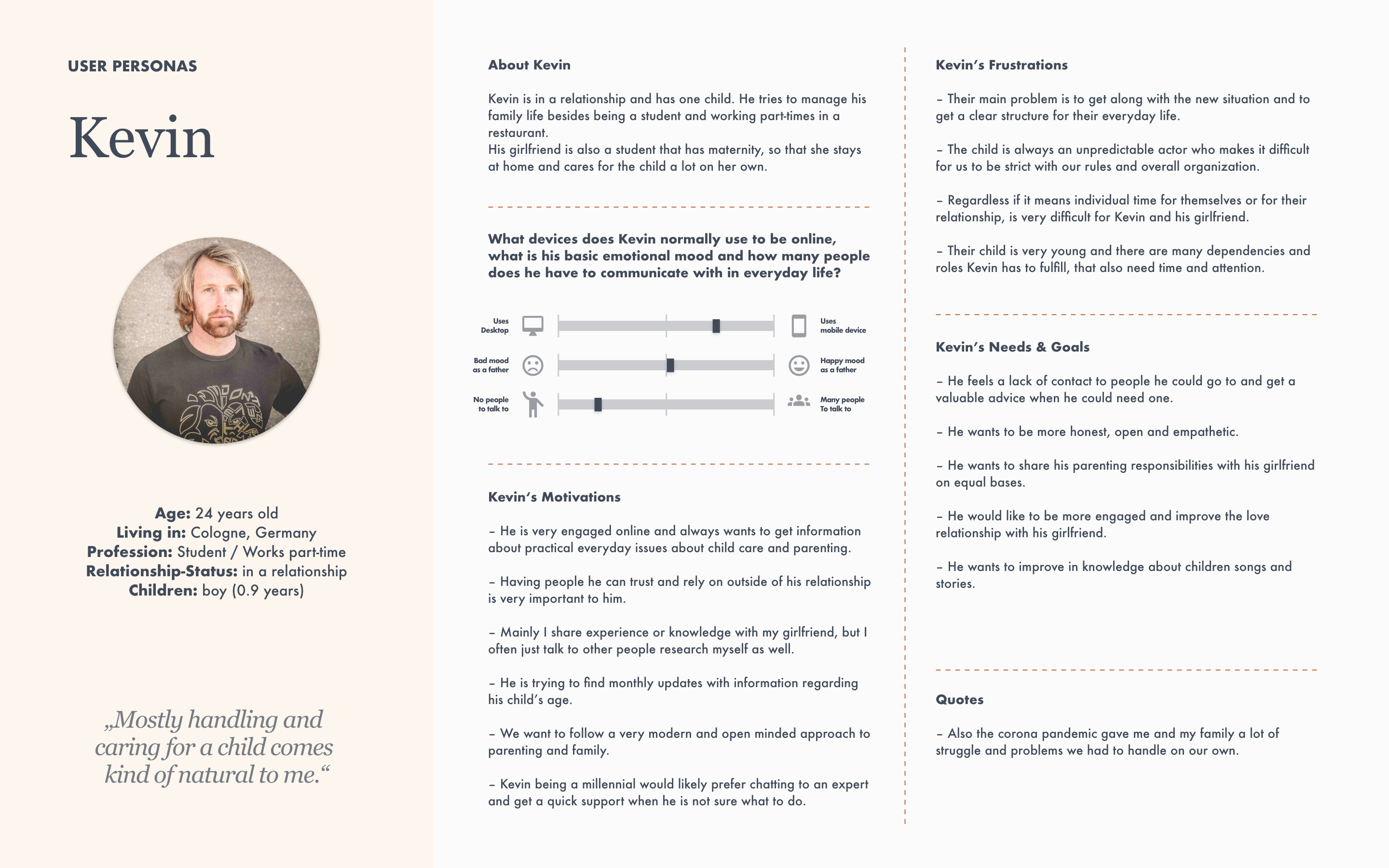
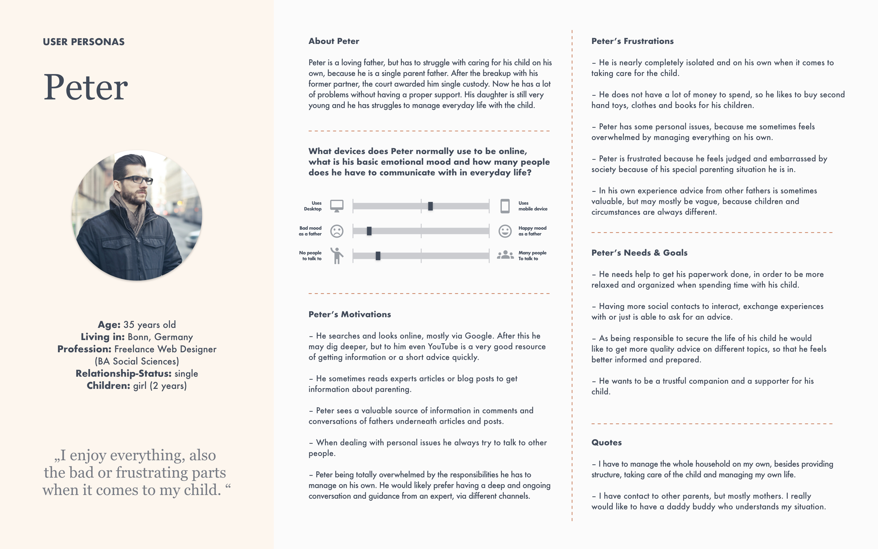
User Persona Creation
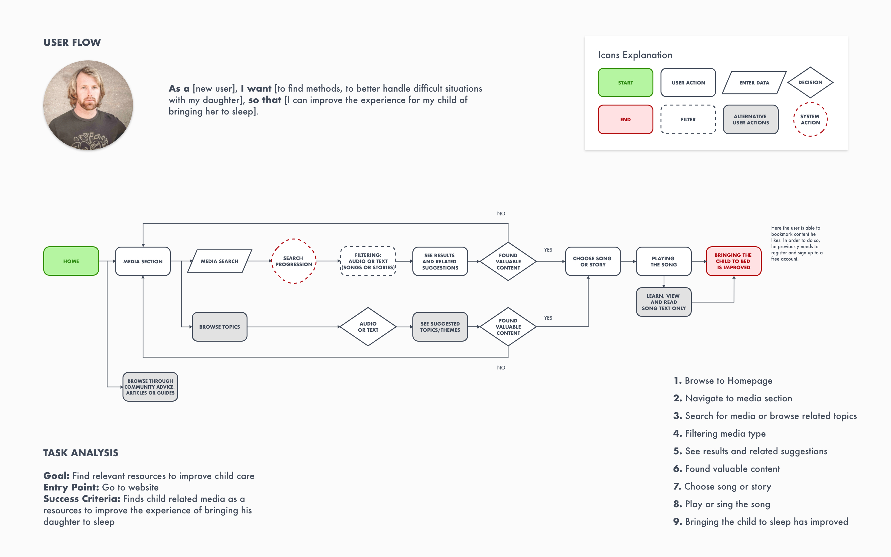
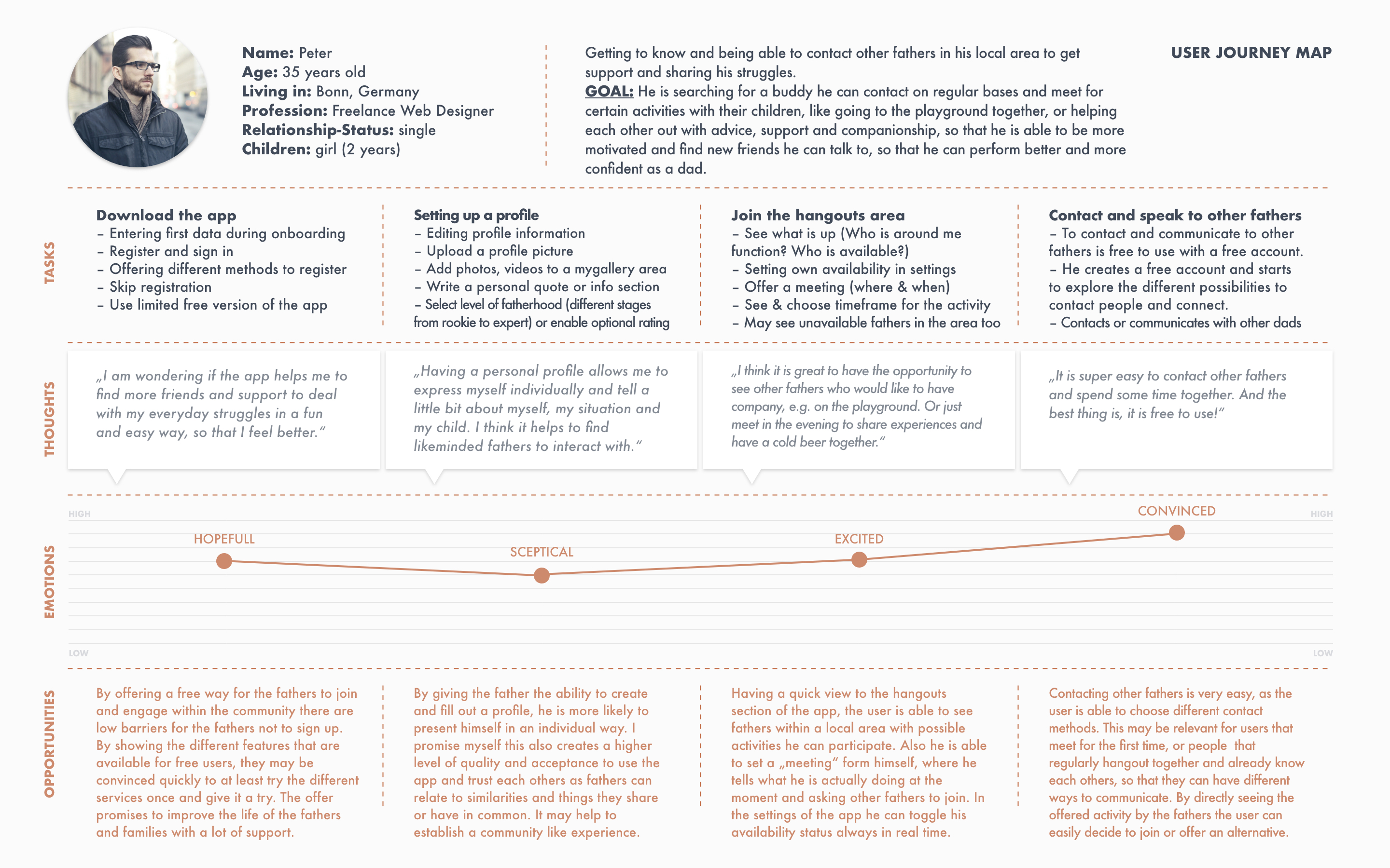
User Journey Mapping
Mobile First Design
Phase 2 – Design
Information Architecture
Card Sorting
Low-Fidelity (Rapid) Prototyping
Mid-Fidelity Wireframes
Design Language System
High-Fidelity Wireframes & Prototypes
Phase 3 – Evaluation
Usability Test Planning
Usability Test
Test Result Evaluation
Future Steps
As I have created a responsive web application it is very interesting to see an example of a new and modern native app like Daddy Up in comparison to a well established and web driven solution, like Daddilife and what they have to offer.
Competitive Analysis Content:
• Competitors’ profile
• Market advantage
• Marketing profile
• SWOT Analysis
• UX/UI Analysis
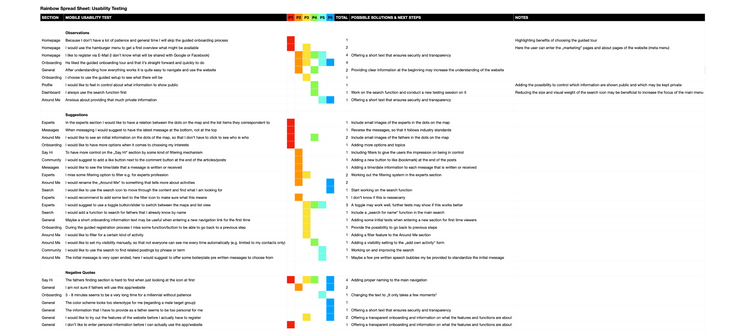
Additionally I conducted several user research methods like interviews, surveys and testing sessions, so that I could prove my hypothesis and whitness how my design decisions work out with potential users. Affinity mapping sessions helped clustering my research results and provided an effective way to make sense and work with the data appropriatly.


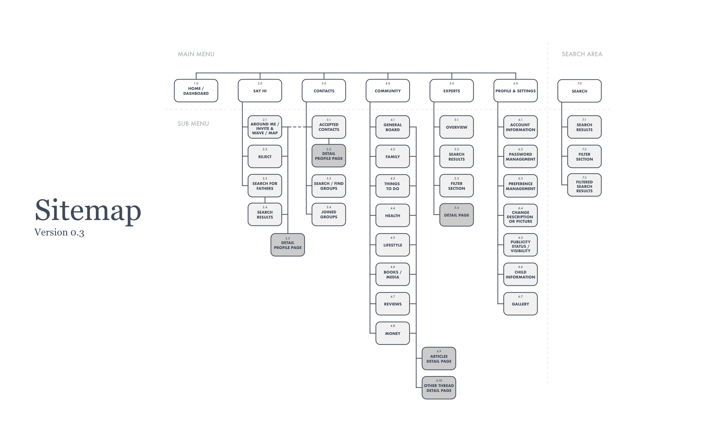
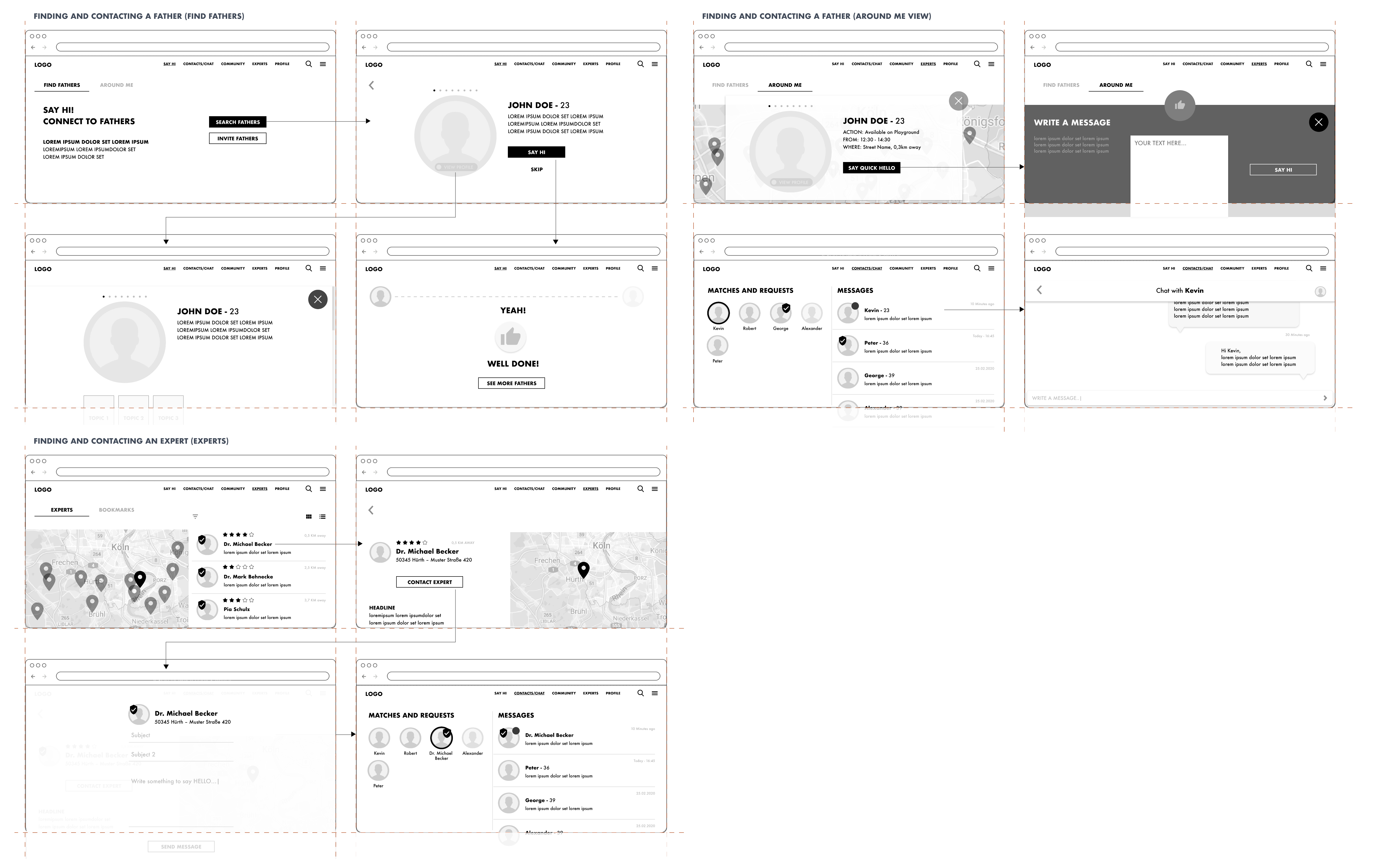
By conducting a heuristic evaluation, a competitive content analysis and a card sorting session I developed this version of the sitemap.
Besides the Home/Dashboard area the website shows the logged in user view. It can be differentiated in to five may areas.
The sitemap creates an important bird’s-eye perspective on the scope and the overall structure of the project itself and supports to inform every further steps and decisions.
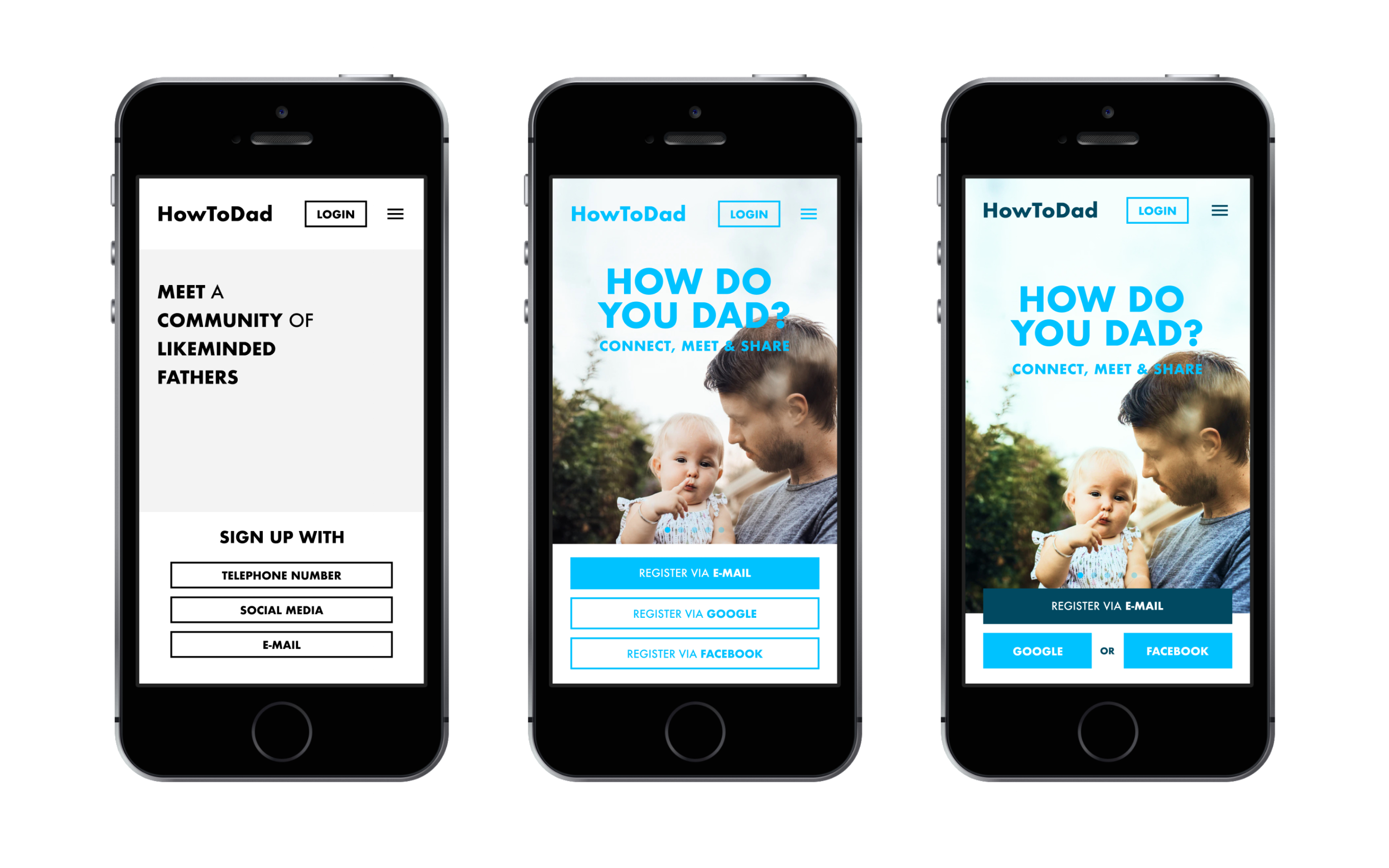
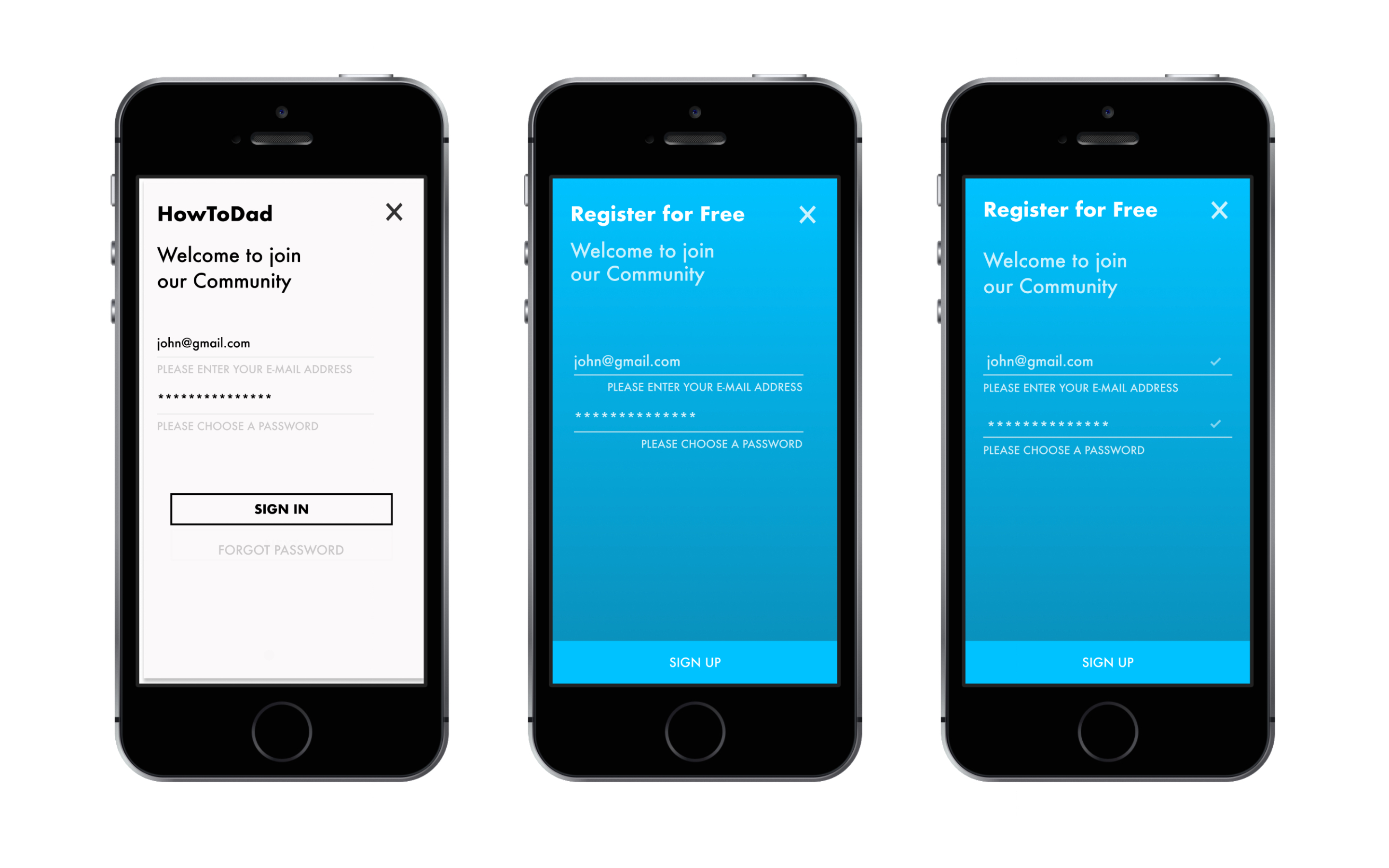
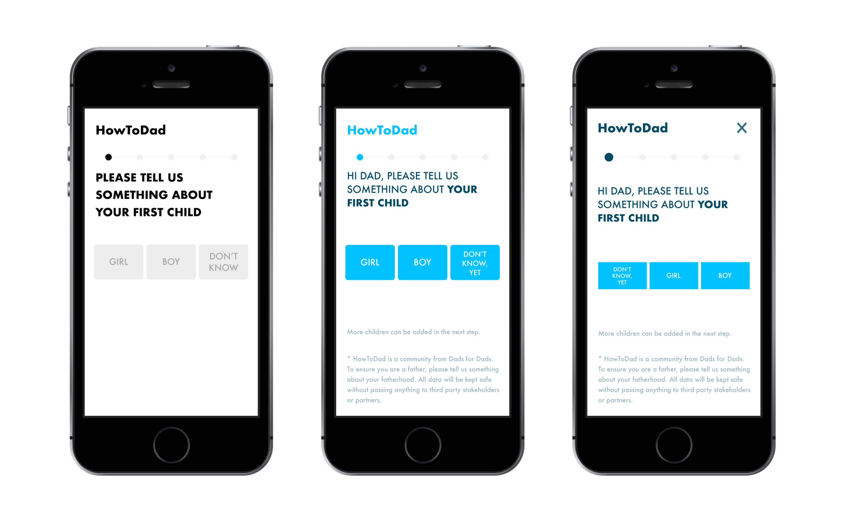
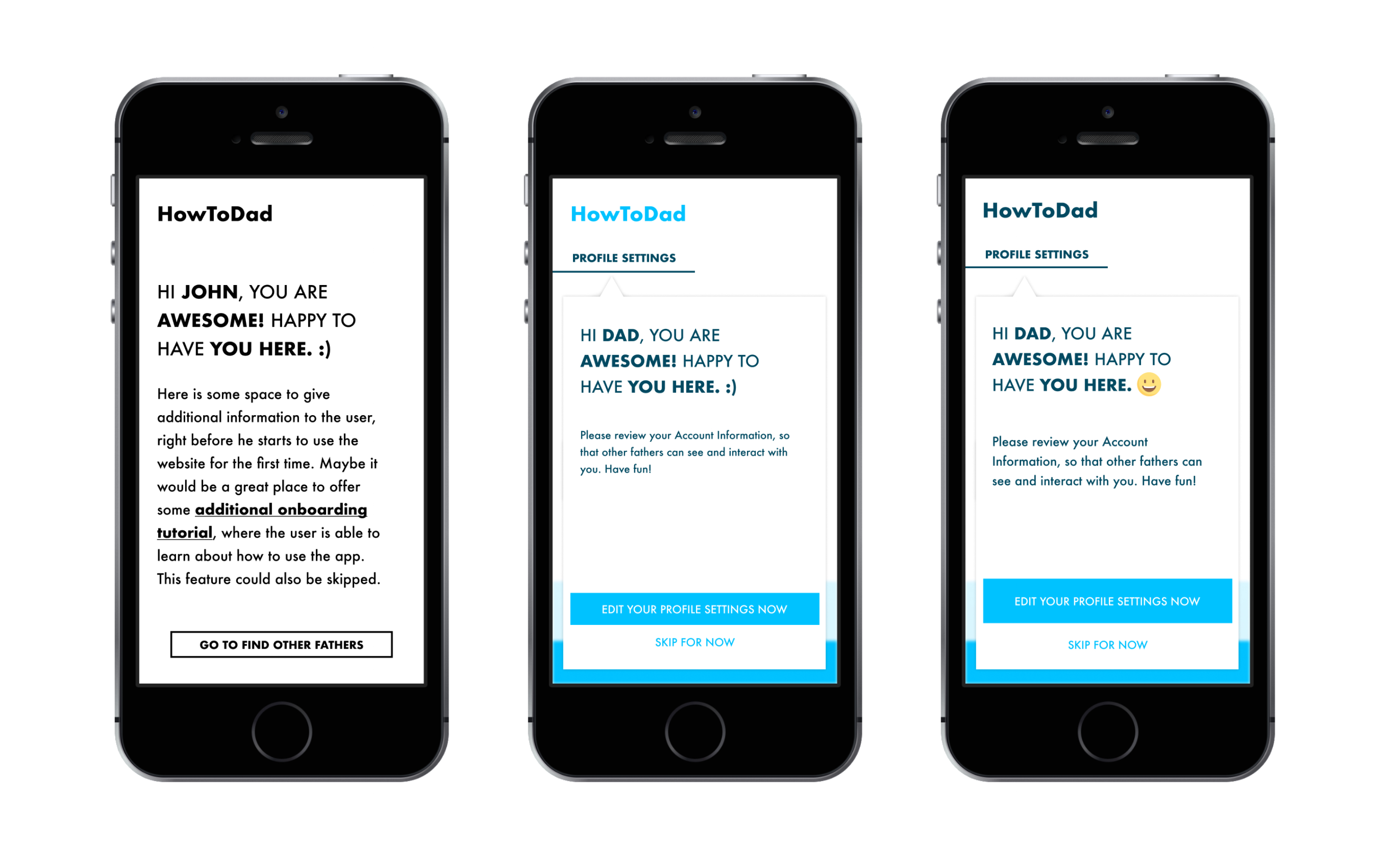
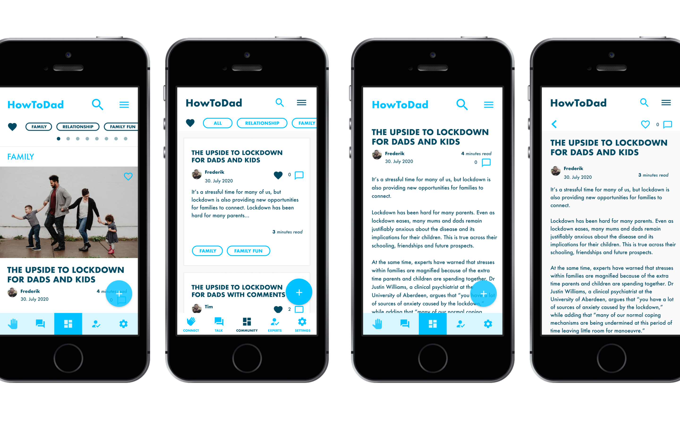
To improve the visual and graphical aspects of the application I developed a first design language system to provide a cohecive look and feel, besides a quickly and easy to understand "language", so that users can navigate and use the website in an intuitive and friendly way.
As the main website deals with child and family related topics, I incorporated different illustrative elements and clear sizing of buttons and copy, so that users and tesing participants can experience the whole experience that the website aims to provide.
When designing the application to a higher level of fidelity I tried to use as much feedback and critique as I could get through in person or remote interviews and user testings.
As I figured out a lot of biased information I had did not match the mental model of my target users, so I designed with that in mind and added certain descriptive or visual to communicate everything on eye level and with the struggles and problems the users might face, when using the system.
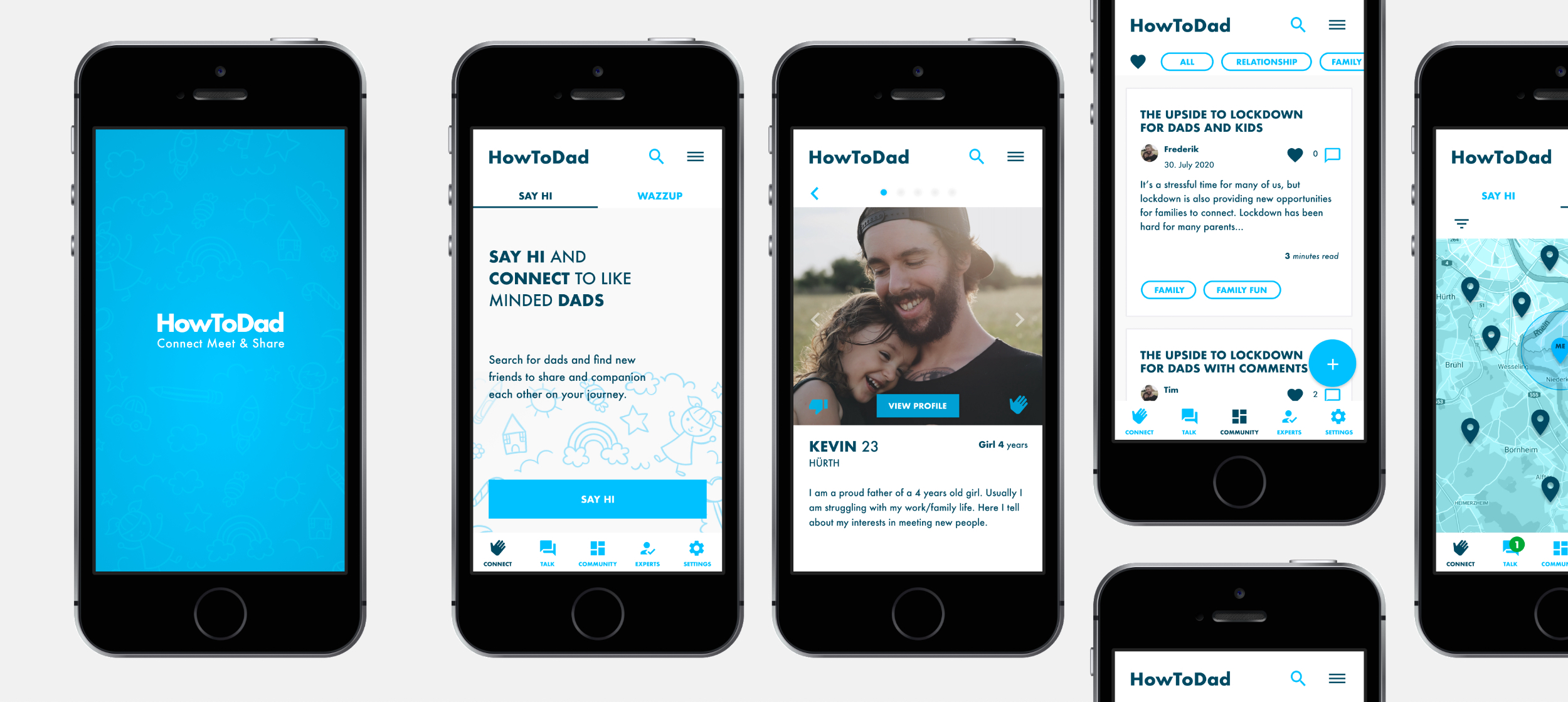
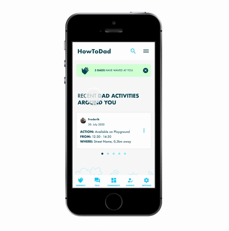
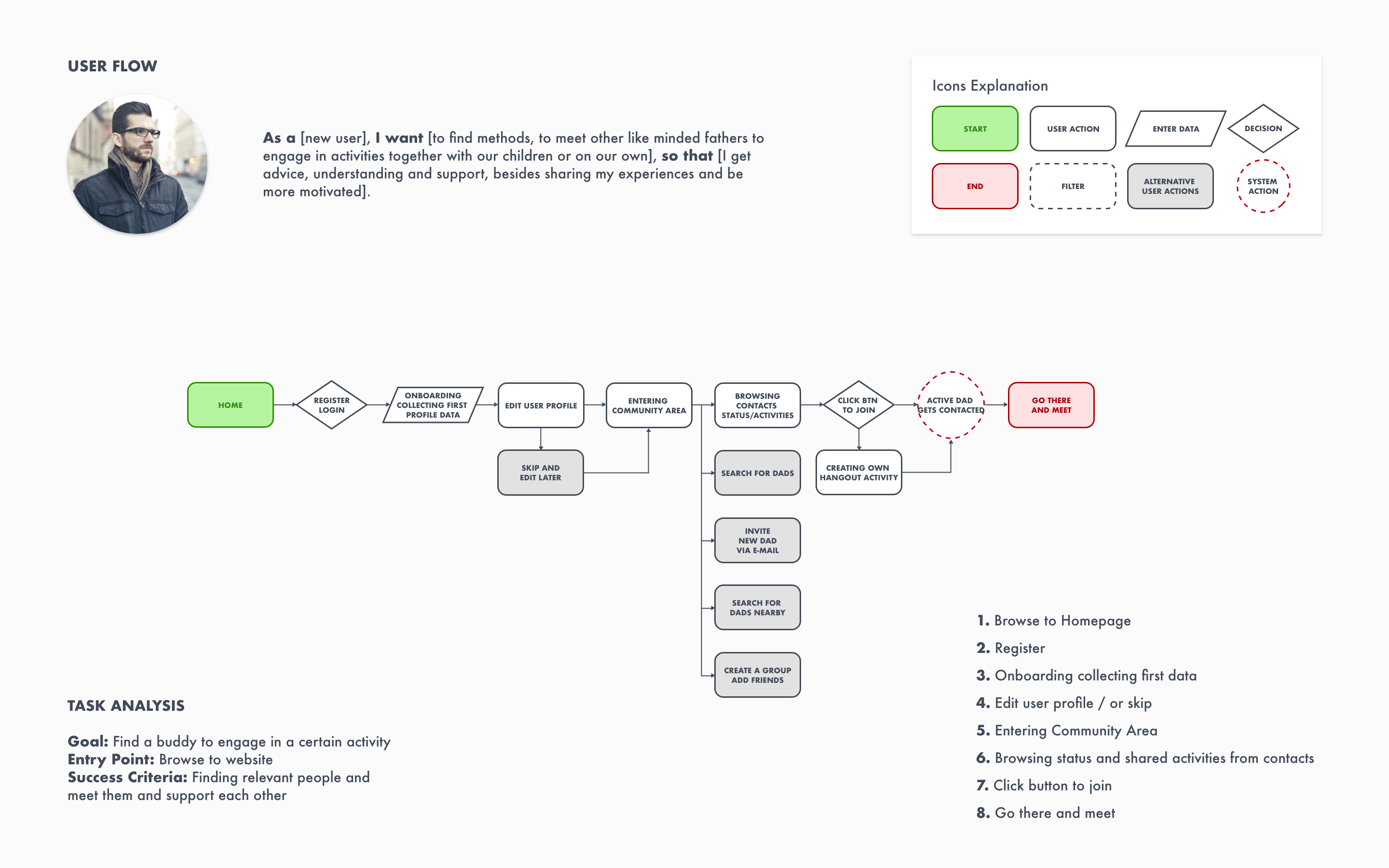
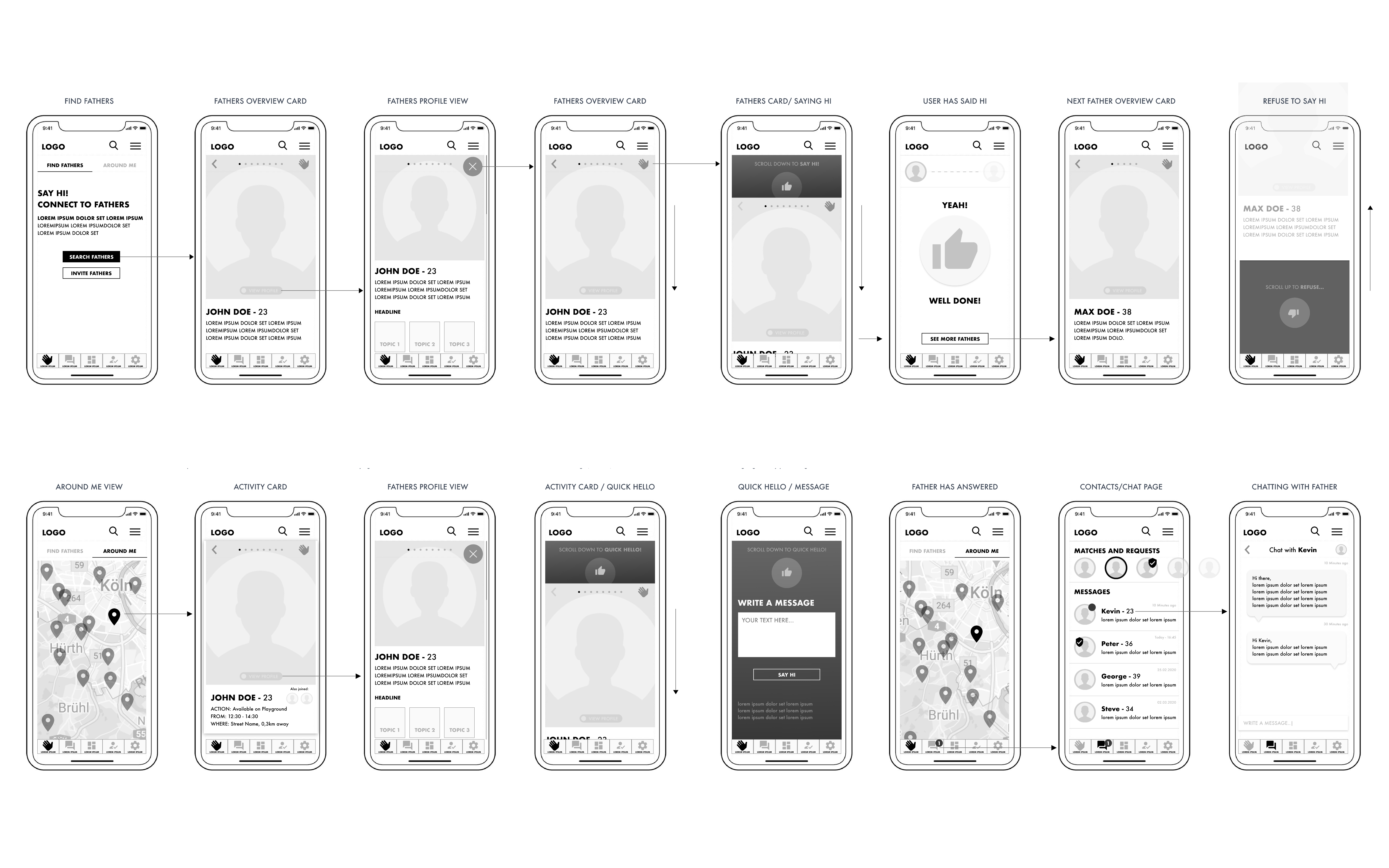
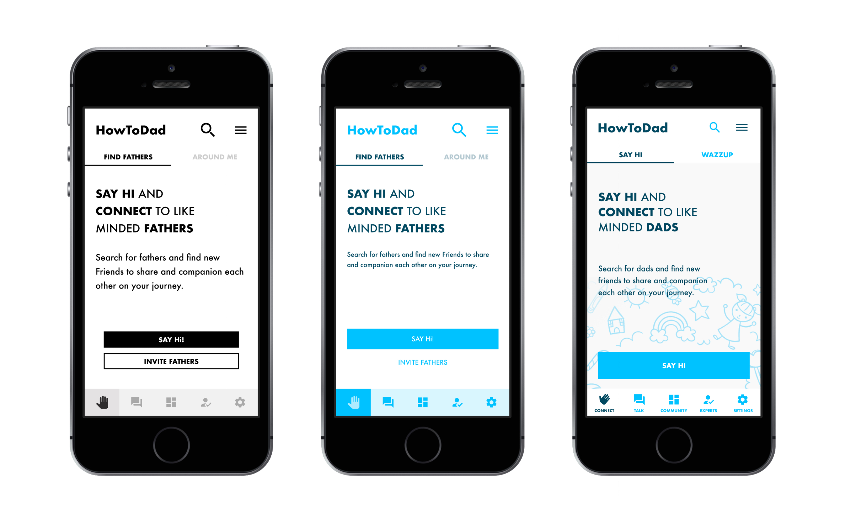
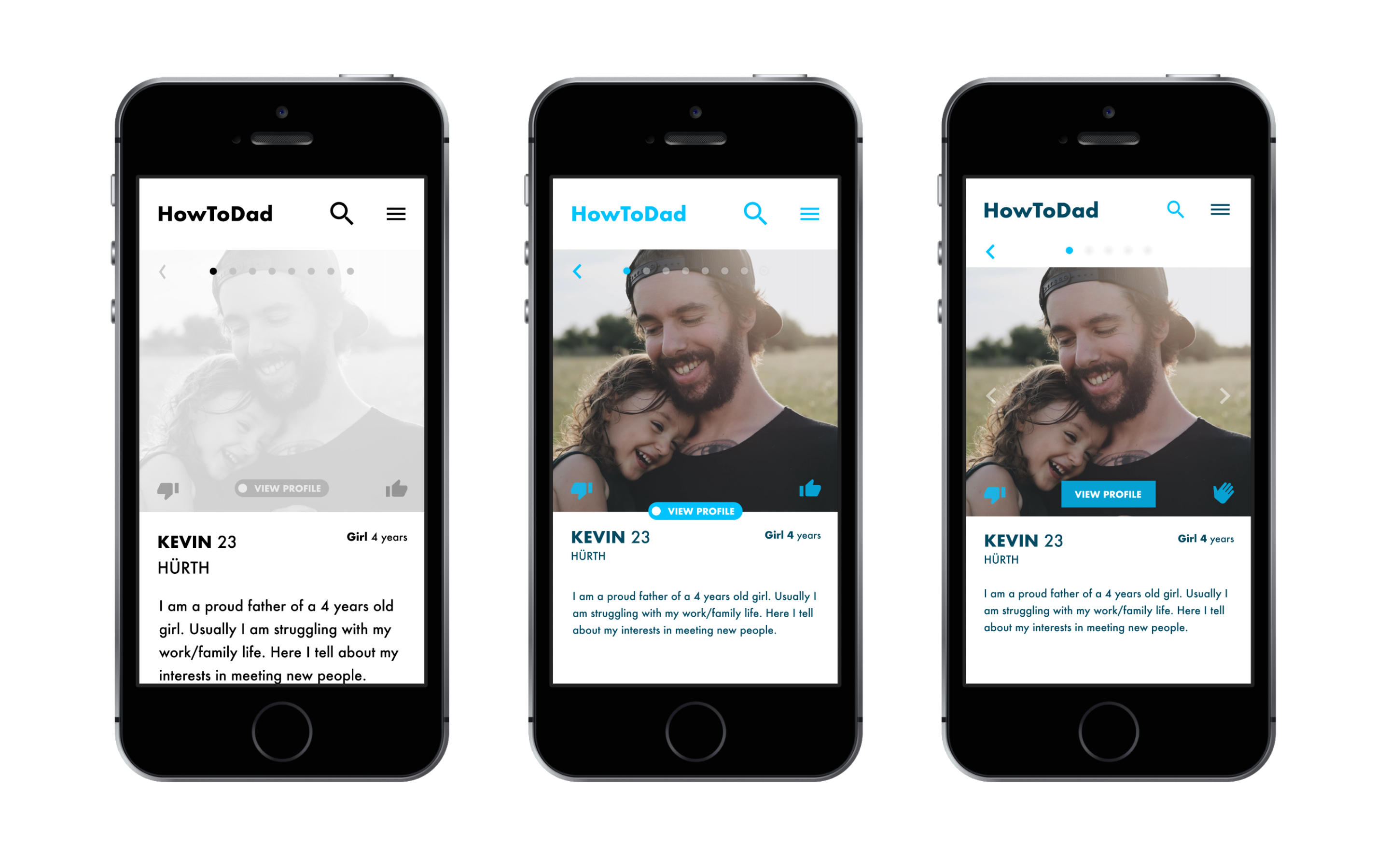
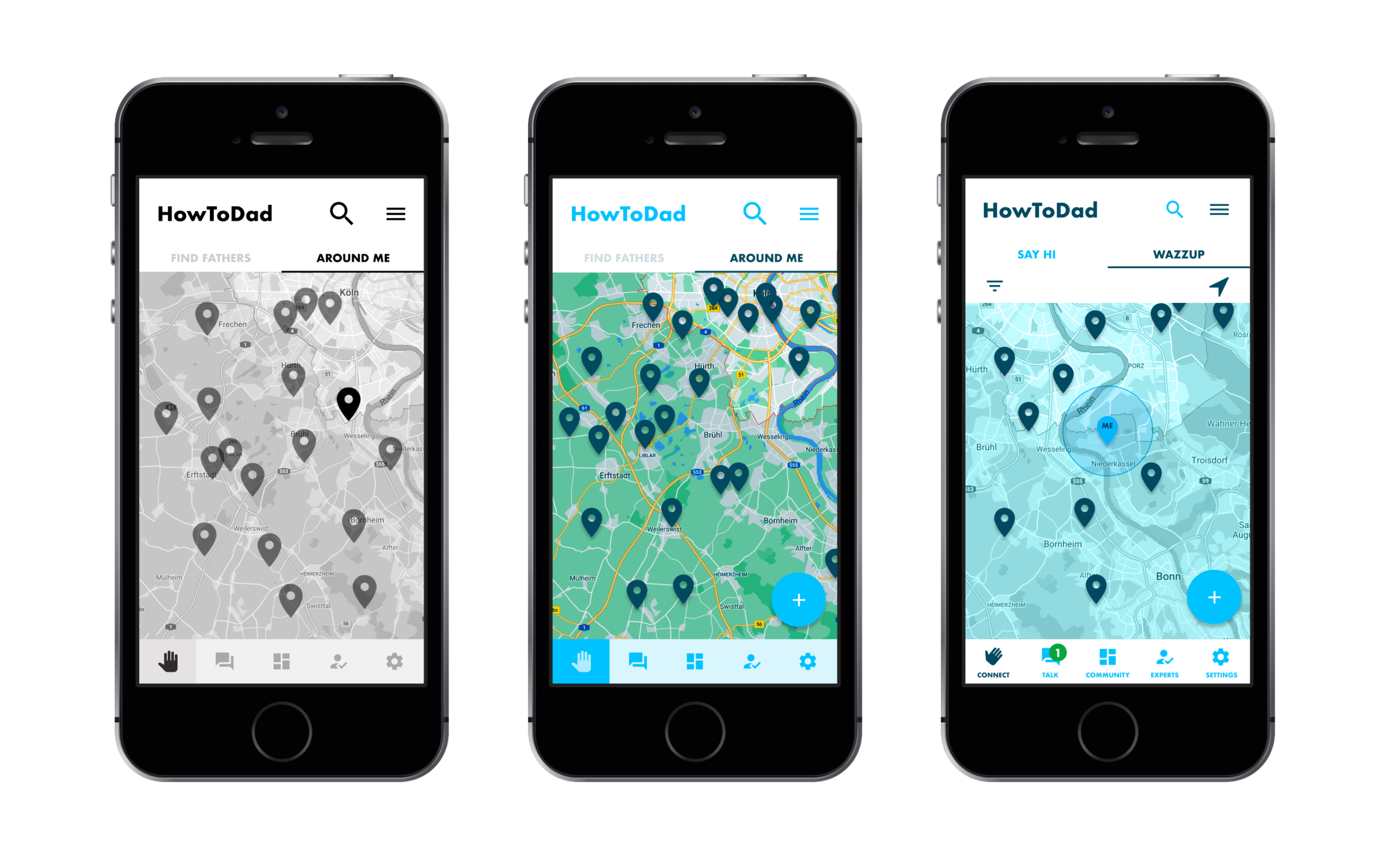
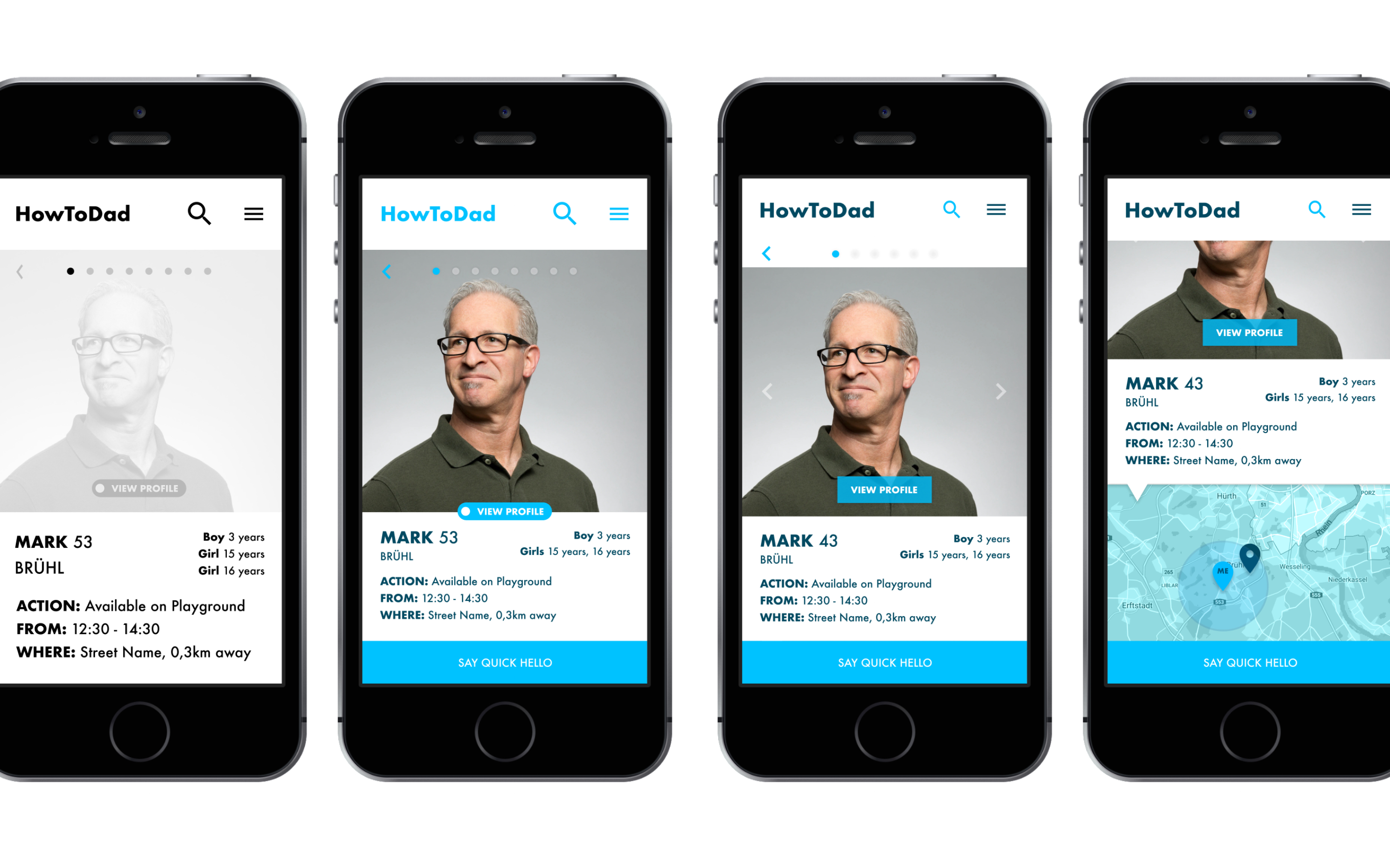
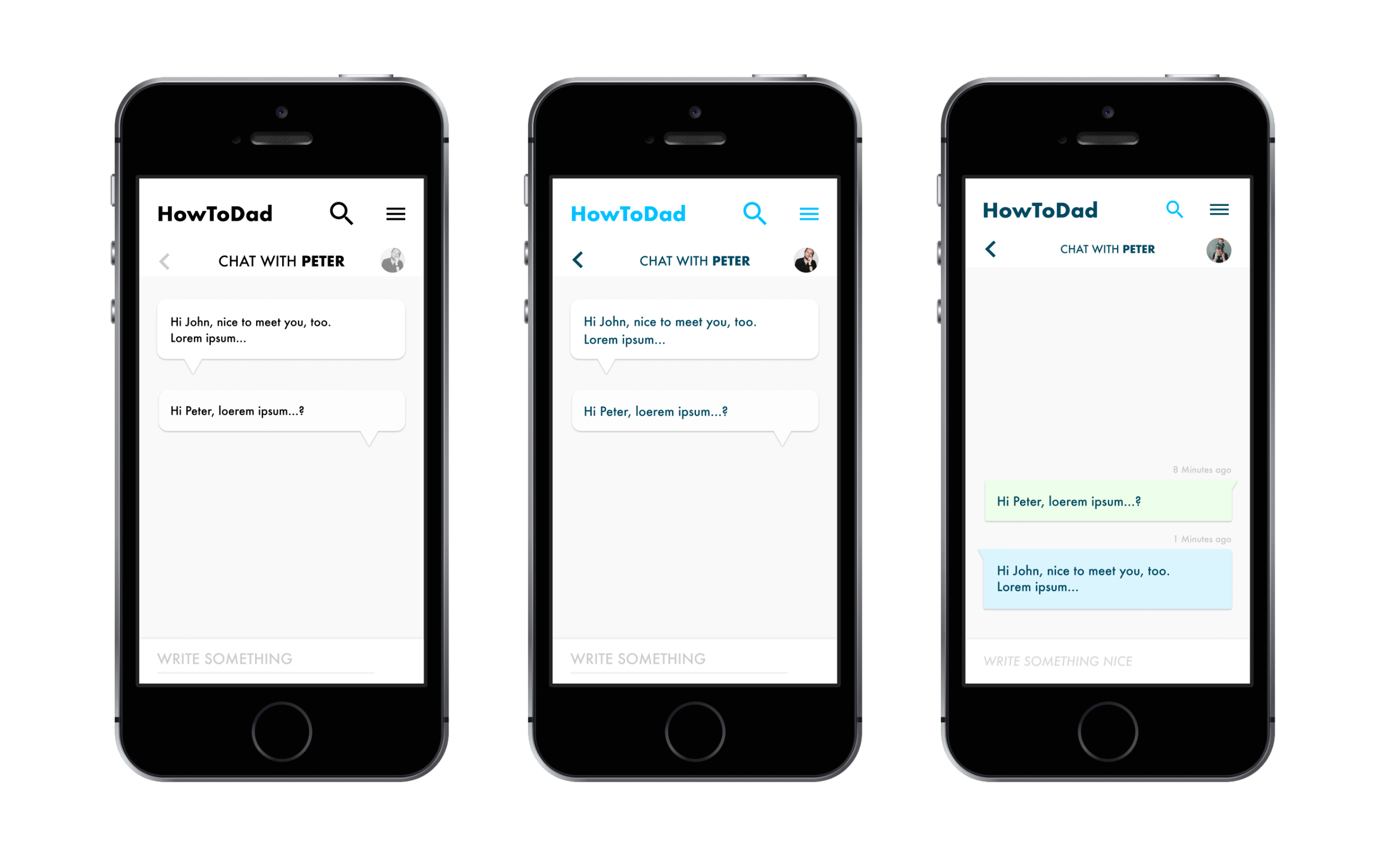
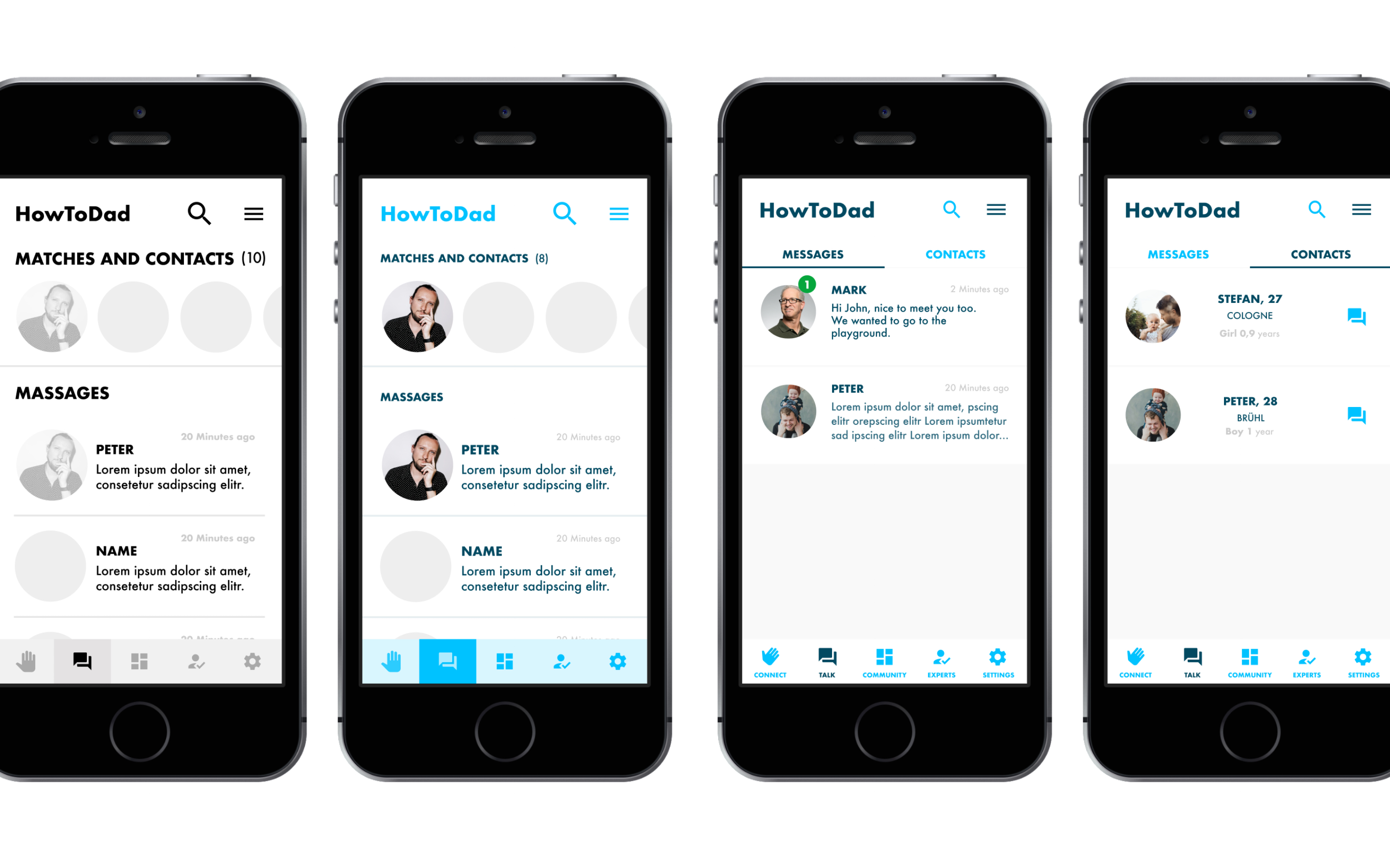
To allow individuals to connect to each other, the website provides a step by step process and methodology that got i.e. established by popular apps like Tinder.
There are different kinds of interaction for the fathers to get in contact and communicate with each others to help and support each other. Other features focus more on the actual live interaction between the fathers.
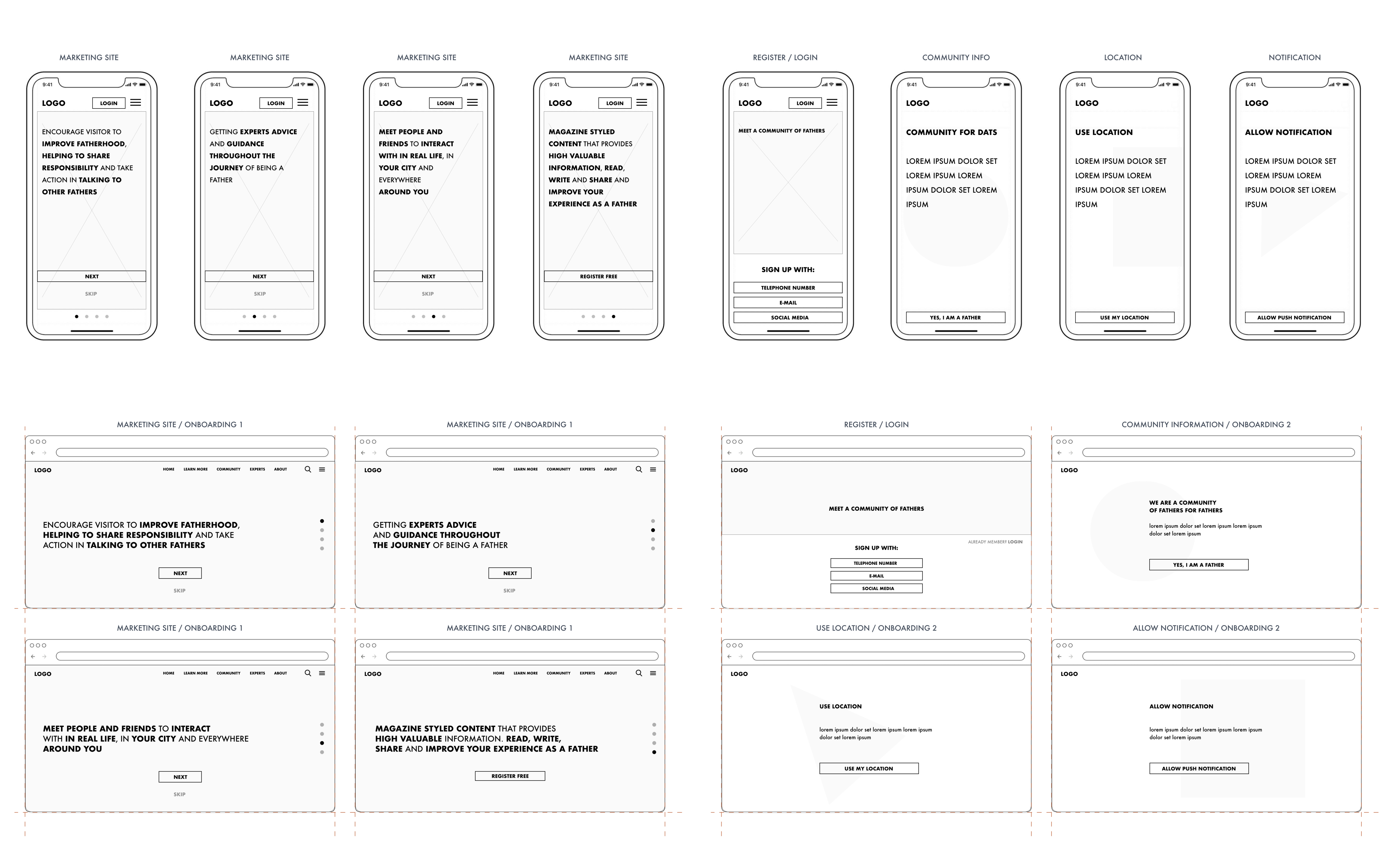
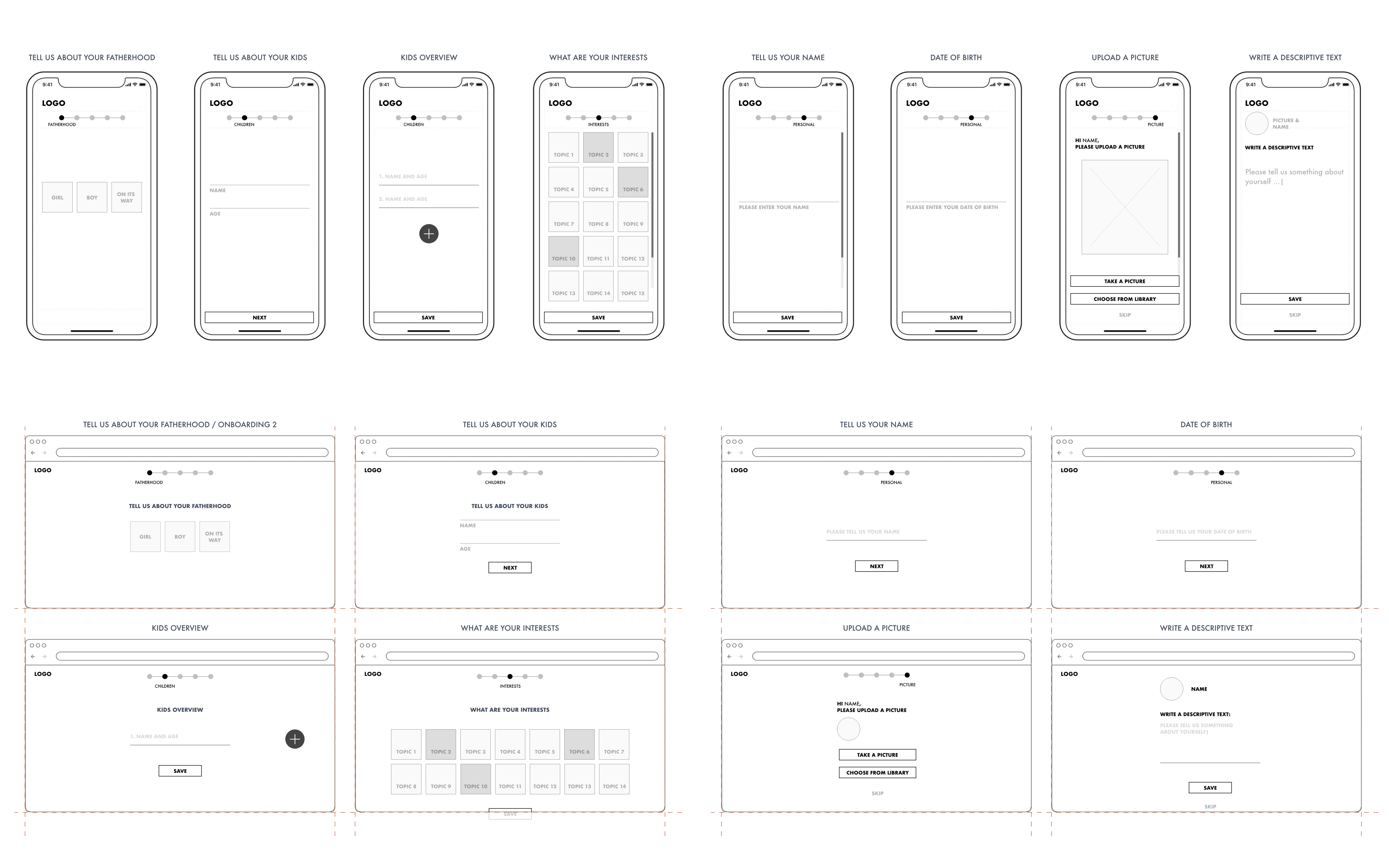
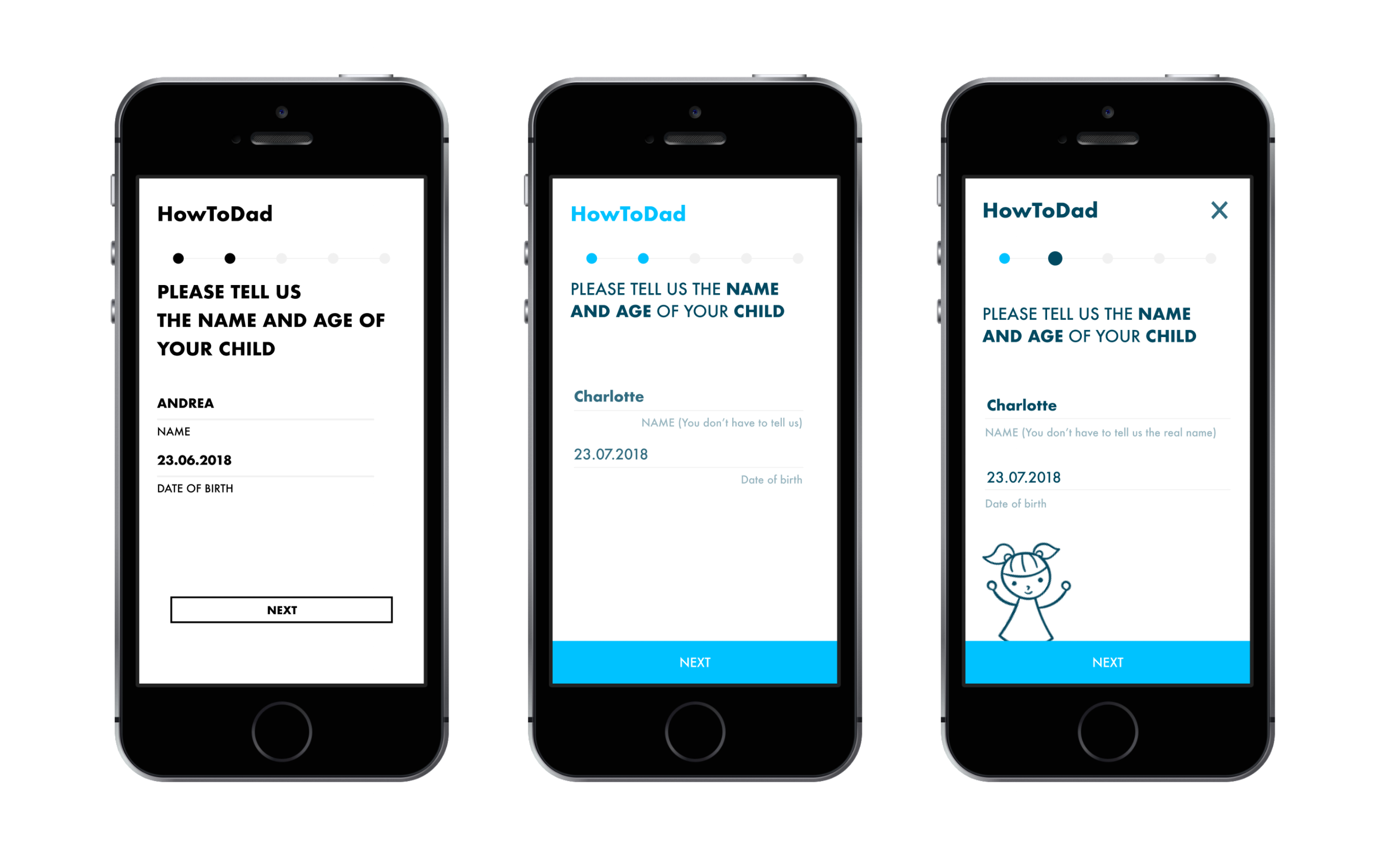
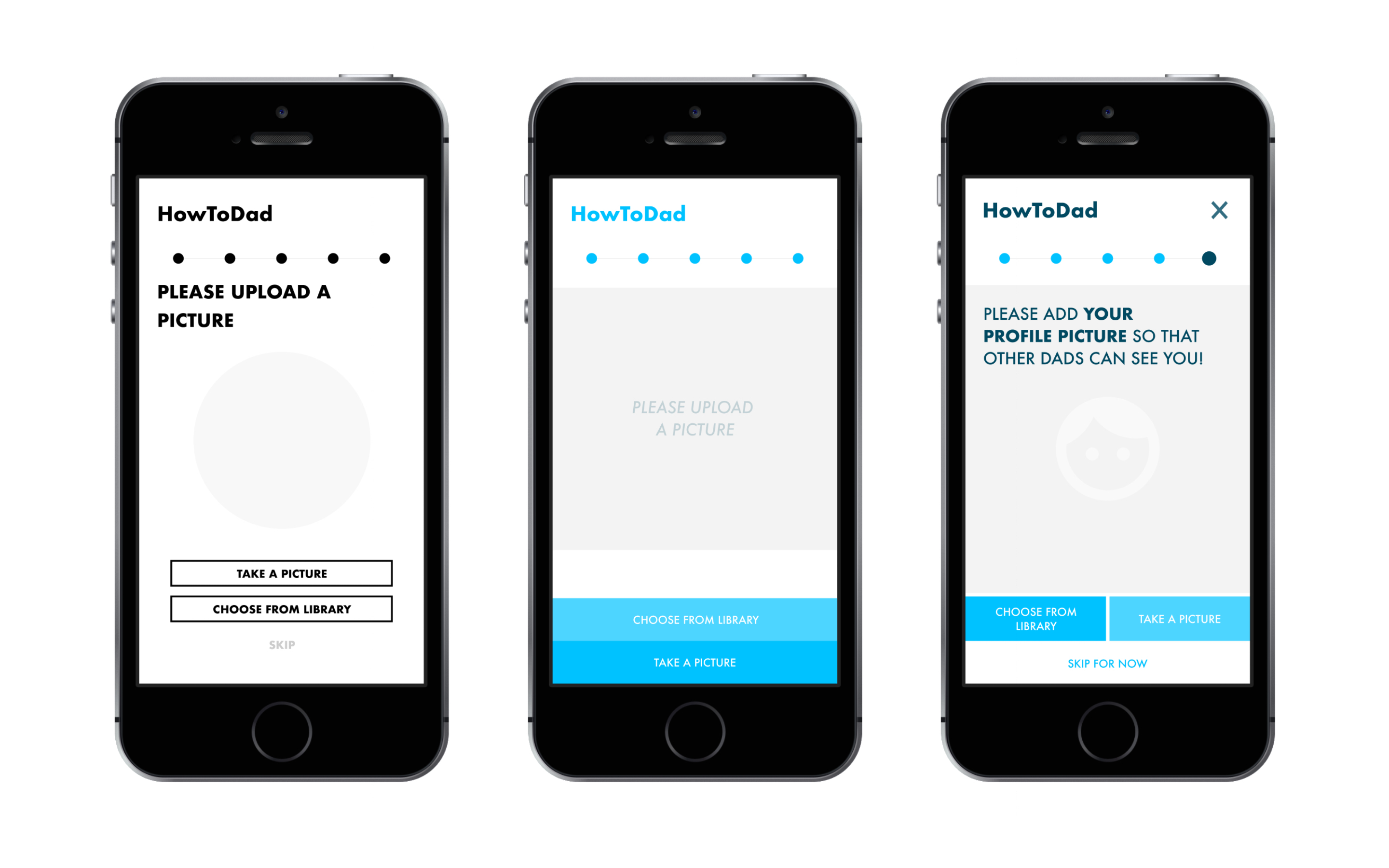
Within the different prototypes, important steps of iteration can be seen and experienced, by using the different prototype versions.
At this stage, the project may need another couple of rounds of iteration and testing, to improve the overall experience for the users.
Below you can see different iterative steps side by side.
(From Low,- to Mid- to Hi-Fidelity).
Introduction
HowToDad Moderated Remote and in Person Usability Test (Mobile Website)
Background
HowToDad is a mobile app that allows fathers to interact in a community of like minded individuals to connect and meet each other in person, besides sharing personal experience and supporting each other with adivce. It is mainly focused on the German market and targeting fathers of different levels, ages and experience to provide and exchange various information about parenting, relationship, work / life balance, the experience of fatherhood and other parenting and family related topics.
Goals
The main goal of this study is to assess the overall learnability for new users interacting with the application for the first Time. I would like to observe and measure if users understand the information architecture, features and functions of the website, its value, and how to complete basic core functions.
Test Objectives
Determine if participants understand what the website is about quickly and easily. To observe how participants navigate the site and if they understand the main features, such as registering as a user, connecting to and finding other dads (in two different ways), engaging in the community and contacting verified experts to get professional advice.
Methodology
The study will be conducted through remote and in person, moderated sessions using Skype and Google Meet. The test will include a short brief, scenario situation with different task performances, and a further debriefing. The task performances will be monitored through the screen sharing options and also recorded via the Quicktime software for later reference.
Participants and Schedule
6 participants were recruited using my personal network and other channels such as Slack. The participants are all male and of different age, nationality and general background. The sessions took place from 12. - 15. November 2020.